iSi Shopping Bags
Graphic Design for iSi’s new shopping bags.
– Credits –
Client: iSi Culinary
Product Design: Sophie Pochtler
Packaging Design: Sophie Pochtler
Photography: Thomas Schwentner
– More Info –
Since shopping bags are a free advertisement space we wanted to create a design that was not only fun and goodlooking but also grabbing as much attention as possible.
Concept 1: Humorous Headlines

In our first concept, we harness the power of humor to capture attention. By incorporating witty and amusing sentences, we aim to evoke smiles and spark curiosity. The design is anchored by a straightforward and legible font, ensuring that even those at a distance can easily read and engage with the message. This simplicity in design amplifies the impact of the humorous content, making it a memorable visual treat for onlookers.
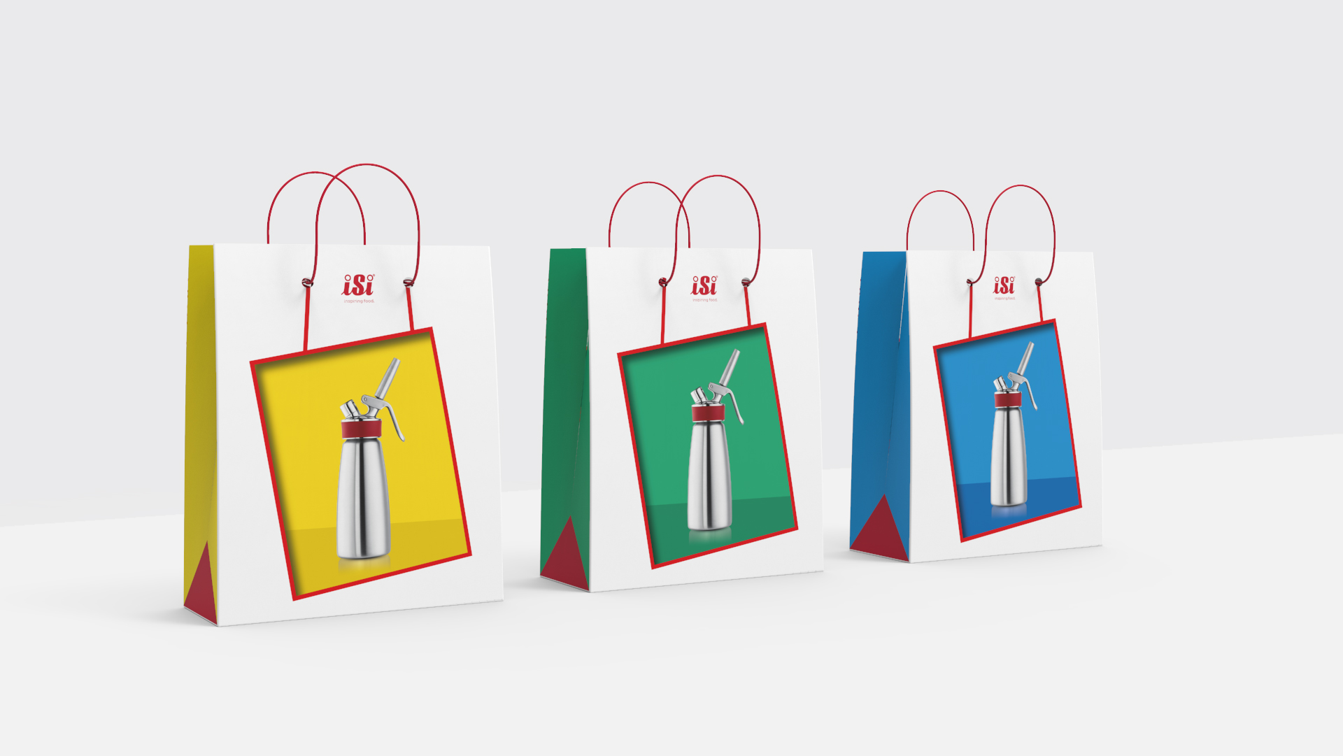
For our third concept, we delve into the realm of optical illusions. The design gives the impression that the bag is transparent, offering a sneak peek into its contents. However, upon closer inspection, it becomes evident that this “see-through” effect is a clever design trick, showcasing a beautifully presented product within. This playful twist not only intrigues viewers but also highlights the product in a unique and captivating manner.
Concept 2: Illusive Insight

Concept 3: Object of Desire

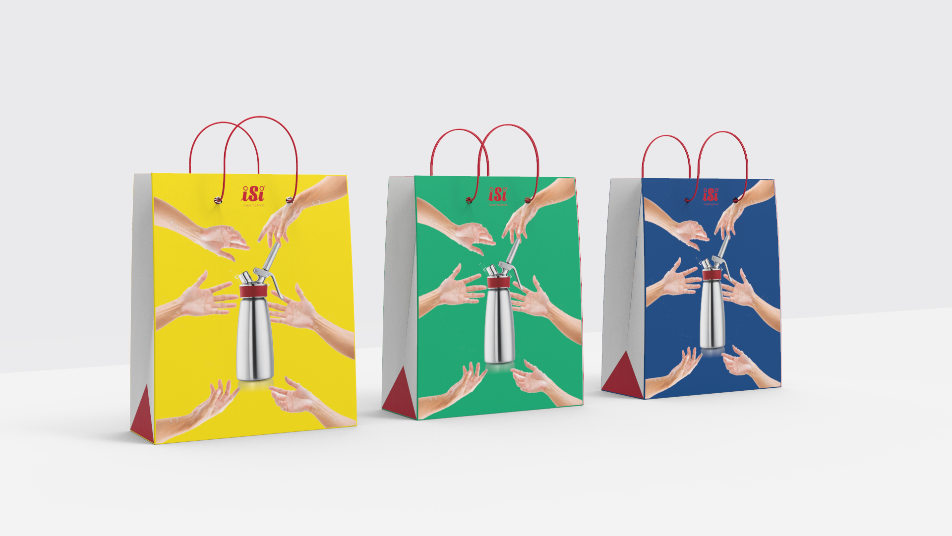
The second concept is all about evoking a sense of longing and desire. By depicting numerous hands reaching out towards the iSi whippers, we visually communicate the high demand and allure of the product. Set against a monochromatic background, the vibrant iSi products take center stage, standing out brilliantly. This stark contrast not only emphasizes the product’s desirability but also ensures it remains the focal point of the design.


